

Bernard TyersAmateur radio software UI design, and the words used.
techhub.social is one of the many independent Mastodon servers you can use to participate in the fediverse.

A hub primarily for passionate technologists, but everyone is welcome
Administered by:
Server stats:
4.6Kactive users
techhub.social: About · Status · Profiles directory · Privacy policy
Mastodon: About · Get the app · Keyboard shortcuts · View source code · v4.4.2
#usability
7 posts · 5 participants · 0 posts today
Bernard TyersAmateur radio software UI design, and the words used.
Bernard TyersAmateur radio software UI design, and the words used.
JustAskRan<p>What’s the difference between accessibility and usability?</p><p>Accessibility is about whether people, including those with disabilities, can use your product at all. </p><p>Usability is about how easily and pleasantly they can use it. </p><p>A website can be usable for most and completely unusable for someone using a screen reader or keyboard. </p><p>Real usability includes accessibility. </p><p>Anything less is just good UX for some.</p><p><a href="https://mastodon.social/tags/WebAccessibility" class="mention hashtag" rel="nofollow noopener" target="_blank">#<span>WebAccessibility</span></a> <a href="https://mastodon.social/tags/InclusiveDesign" class="mention hashtag" rel="nofollow noopener" target="_blank">#<span>InclusiveDesign</span></a> <a href="https://mastodon.social/tags/Usability" class="mention hashtag" rel="nofollow noopener" target="_blank">#<span>Usability</span></a> <a href="https://mastodon.social/tags/AccessibilityTips" class="mention hashtag" rel="nofollow noopener" target="_blank">#<span>AccessibilityTips</span></a></p>
Jerome<p>Five usability- and design sites I use:</p><p>1. Discount software-design method:<br><a href="https://fivesketches.com/quality-software-designs-by-sketching/" rel="nofollow noopener" translate="no" target="_blank"><span class="invisible">https://</span><span class="ellipsis">fivesketches.com/quality-softw</span><span class="invisible">are-designs-by-sketching/</span></a></p><p>2. UK's methods and patterns:<br><a href="https://design-system.service.gov.uk/" rel="nofollow noopener" translate="no" target="_blank"><span class="invisible">https://</span><span class="">design-system.service.gov.uk/</span><span class="invisible"></span></a></p><p>3. Nielsen Norman Group's posts about user research and design:<br><a href="https://www.nngroup.com/articles/" rel="nofollow noopener" translate="no" target="_blank"><span class="invisible">https://www.</span><span class="">nngroup.com/articles/</span><span class="invisible"></span></a></p><p>4. MeasuringU's posts about research statistics:<br><a href="https://measuringu.com/" rel="nofollow noopener" translate="no" target="_blank"><span class="invisible">https://</span><span class="">measuringu.com/</span><span class="invisible"></span></a></p><p>5. USA's definitions and resources:<br><a href="https://digital.gov/resources" rel="nofollow noopener" translate="no" target="_blank"><span class="invisible">https://</span><span class="">digital.gov/resources</span><span class="invisible"></span></a></p><p><a href="https://mastodon.social/tags/usability" class="mention hashtag" rel="nofollow noopener" target="_blank">#<span>usability</span></a> <a href="https://mastodon.social/tags/UX" class="mention hashtag" rel="nofollow noopener" target="_blank">#<span>UX</span></a> <a href="https://mastodon.social/tags/UserExperience" class="mention hashtag" rel="nofollow noopener" target="_blank">#<span>UserExperience</span></a> <a href="https://mastodon.social/tags/UI" class="mention hashtag" rel="nofollow noopener" target="_blank">#<span>UI</span></a> <a href="https://mastodon.social/tags/IxD" class="mention hashtag" rel="nofollow noopener" target="_blank">#<span>IxD</span></a> <a href="https://mastodon.social/tags/UR" class="mention hashtag" rel="nofollow noopener" target="_blank">#<span>UR</span></a> <a href="https://mastodon.social/tags/UCD" class="mention hashtag" rel="nofollow noopener" target="_blank">#<span>UCD</span></a> <a href="https://mastodon.social/tags/UserResearch" class="mention hashtag" rel="nofollow noopener" target="_blank">#<span>UserResearch</span></a> <a href="https://mastodon.social/tags/research" class="mention hashtag" rel="nofollow noopener" target="_blank">#<span>research</span></a> <a href="https://mastodon.social/tags/design" class="mention hashtag" rel="nofollow noopener" target="_blank">#<span>design</span></a> <a href="https://mastodon.social/tags/method" class="mention hashtag" rel="nofollow noopener" target="_blank">#<span>method</span></a> <a href="https://mastodon.social/tags/guide" class="mention hashtag" rel="nofollow noopener" target="_blank">#<span>guide</span></a> <a href="https://mastodon.social/tags/statistics" class="mention hashtag" rel="nofollow noopener" target="_blank">#<span>statistics</span></a> <a href="https://mastodon.social/tags/software" class="mention hashtag" rel="nofollow noopener" target="_blank">#<span>software</span></a></p>
AskUbuntu<p>Request for a better design <a href="https://ubuntu.social/tags/usability" class="mention hashtag" rel="nofollow noopener" target="_blank">#<span>usability</span></a></p><p><a href="https://askubuntu.com/q/1553609/612" rel="nofollow noopener" translate="no" target="_blank"><span class="invisible">https://</span><span class="">askubuntu.com/q/1553609/612</span><span class="invisible"></span></a></p>
Søren<p>The existence of questions like this tell a sad story of <a href="https://expressional.social/tags/usability" class="mention hashtag" rel="nofollow noopener" target="_blank">#<span>usability</span></a> in <a href="https://expressional.social/tags/LibreOffice" class="mention hashtag" rel="nofollow noopener" target="_blank">#<span>LibreOffice</span></a>. I wish it was different.</p>
🔏 Matthias Wiesmann<p>Peak copy paste </p><p><a href="https://wiesmann.codiferes.net/wordpress/archives/41198" rel="nofollow noopener" translate="no" target="_blank"><span class="invisible">https://</span><span class="ellipsis">wiesmann.codiferes.net/wordpre</span><span class="invisible">ss/archives/41198</span></a> </p><p><a href="https://mastodon.social/tags/ClassicMac" class="mention hashtag" rel="nofollow noopener" target="_blank">#<span>ClassicMac</span></a> <a href="https://mastodon.social/tags/CopyPaste" class="mention hashtag" rel="nofollow noopener" target="_blank">#<span>CopyPaste</span></a> <a href="https://mastodon.social/tags/DataExchange" class="mention hashtag" rel="nofollow noopener" target="_blank">#<span>DataExchange</span></a> <a href="https://mastodon.social/tags/usability" class="mention hashtag" rel="nofollow noopener" target="_blank">#<span>usability</span></a></p>
Tao of Mac<p>iPadOS 26 Beta - A Frustrating Design Regression</p><p>Against my better judgment I went and installed iPadOS 26 Beta on my M1 Pro iPad, and… it’s a mess.(...)</p><p><a href="https://mastodon.social/tags/apple" class="mention hashtag" rel="nofollow noopener" target="_blank">#<span>apple</span></a> <a href="https://mastodon.social/tags/beta" class="mention hashtag" rel="nofollow noopener" target="_blank">#<span>beta</span></a> <a href="https://mastodon.social/tags/design" class="mention hashtag" rel="nofollow noopener" target="_blank">#<span>design</span></a> <a href="https://mastodon.social/tags/ipad" class="mention hashtag" rel="nofollow noopener" target="_blank">#<span>ipad</span></a> <a href="https://mastodon.social/tags/ipados" class="mention hashtag" rel="nofollow noopener" target="_blank">#<span>ipados</span></a> <a href="https://mastodon.social/tags/review" class="mention hashtag" rel="nofollow noopener" target="_blank">#<span>review</span></a> <a href="https://mastodon.social/tags/ui" class="mention hashtag" rel="nofollow noopener" target="_blank">#<span>ui</span></a> <a href="https://mastodon.social/tags/usability" class="mention hashtag" rel="nofollow noopener" target="_blank">#<span>usability</span></a></p><p><a href="https://taoofmac.com/space/blog/2025/07/25/2200" rel="nofollow noopener" translate="no" target="_blank"><span class="invisible">https://</span><span class="ellipsis">taoofmac.com/space/blog/2025/0</span><span class="invisible">7/25/2200</span></a></p>
Carsten Hoffmann<p><span class="h-card" translate="no"><a href="https://social.tchncs.de/@ilx" class="u-url mention" rel="nofollow noopener" target="_blank">@<span>ilx</span></a></span> Ich frage mich da immer: nutzt eigentlich irgendwer der dort arbeitet den eigenen Shop? Das kann doch eigentlich nicht sein, sonst würde sowas doch auffallen... <a href="https://hessen.social/tags/usability" class="mention hashtag" rel="nofollow noopener" target="_blank">#<span>usability</span></a></p>
Joseph Leedy :magento:<p>This is something that has vexed me completely since switching back to Fedora from macOS. It would be nice if I could just double tap a key in Gnome and pick from an overlay just like I did in macOS. 😞</p><p><a href="https://phpc.social/tags/Gnome" class="mention hashtag" rel="nofollow noopener" target="_blank">#<span>Gnome</span></a> <a href="https://phpc.social/tags/Fedora" class="mention hashtag" rel="nofollow noopener" target="_blank">#<span>Fedora</span></a> <a href="https://phpc.social/tags/Linux" class="mention hashtag" rel="nofollow noopener" target="_blank">#<span>Linux</span></a> <a href="https://phpc.social/tags/Usability" class="mention hashtag" rel="nofollow noopener" target="_blank">#<span>Usability</span></a><br><a href="https://indieweb.social/@evert/114905588320795471" rel="nofollow noopener" translate="no" target="_blank"><span class="invisible">https://</span><span class="ellipsis">indieweb.social/@evert/1149055</span><span class="invisible">88320795471</span></a></p>
Jerome<p>Last month, when I travelled to another time zone, for a brief part of the day my phone and I would be in a different day from my bank's systems.</p><p>The banking app would refuse to let me make payments when there was a "mismatch" of dates. This reduced the time I could pay on both ends of the day. 📅</p><p><a href="https://mastodon.social/tags/usability" class="mention hashtag" rel="nofollow noopener" target="_blank">#<span>usability</span></a> <a href="https://mastodon.social/tags/fraud" class="mention hashtag" rel="nofollow noopener" target="_blank">#<span>fraud</span></a> <a href="https://mastodon.social/tags/banking" class="mention hashtag" rel="nofollow noopener" target="_blank">#<span>banking</span></a> <a href="https://mastodon.social/tags/app" class="mention hashtag" rel="nofollow noopener" target="_blank">#<span>app</span></a> <a href="https://mastodon.social/tags/software" class="mention hashtag" rel="nofollow noopener" target="_blank">#<span>software</span></a> <a href="https://mastodon.social/tags/SoftwareDesign" class="mention hashtag" rel="nofollow noopener" target="_blank">#<span>SoftwareDesign</span></a> <a href="https://mastodon.social/tags/fail" class="mention hashtag" rel="nofollow noopener" target="_blank">#<span>fail</span></a> <a href="https://mastodon.social/tags/EdgeCase" class="mention hashtag" rel="nofollow noopener" target="_blank">#<span>EdgeCase</span></a> <a href="https://mastodon.social/tags/UseCase" class="mention hashtag" rel="nofollow noopener" target="_blank">#<span>UseCase</span></a></p>
Jerome<p>I just finished a usability study of an online, data-intensive tool for use on ships at sea. Some sailors I spoke to—and screen-shared with—were on Starlink.</p><p>While at sea, costly Internet access represents video calls home, sea-state forecasts, tracking, reporting, and planning efficiency.</p><p>Using methods we don't like to build a satellite network doesn't negate its utility.</p><p>To change methods we don't like requires awareness and regulation.</p><p><a href="https://mastodon.social/tags/satellite" class="mention hashtag" rel="nofollow noopener" target="_blank">#<span>satellite</span></a> <a href="https://mastodon.social/tags/Internet" class="mention hashtag" rel="nofollow noopener" target="_blank">#<span>Internet</span></a> <a href="https://mastodon.social/tags/UX" class="mention hashtag" rel="nofollow noopener" target="_blank">#<span>UX</span></a> <a href="https://mastodon.social/tags/usability" class="mention hashtag" rel="nofollow noopener" target="_blank">#<span>usability</span></a> <a href="https://mastodon.social/tags/Starlink" class="mention hashtag" rel="nofollow noopener" target="_blank">#<span>Starlink</span></a> <a href="https://mastodon.social/tags/ethics" class="mention hashtag" rel="nofollow noopener" target="_blank">#<span>ethics</span></a></p>
Jerome<p>Not to pick on toot.wales, because where this link leads is just one example, but it is definitely …</p><p>… an example of why some people say Mastodon is difficult to use.</p><p>Being unusable is about more than not knowing what to click. It starts with incomprehensible text and taxonomy that present hurdles in searching for elements (buttons, links) in the interface and to correctly guessing the effect of using those elements.</p><p><a href="https://toot.wales/@teamtoot/114909739468790789" rel="nofollow noopener" translate="no" target="_blank"><span class="invisible">https://</span><span class="ellipsis">toot.wales/@teamtoot/114909739</span><span class="invisible">468790789</span></a></p><p><a href="https://mastodon.social/tags/usability" class="mention hashtag" rel="nofollow noopener" target="_blank">#<span>usability</span></a> <a href="https://mastodon.social/tags/UX" class="mention hashtag" rel="nofollow noopener" target="_blank">#<span>UX</span></a> <a href="https://mastodon.social/tags/Mastodon" class="mention hashtag" rel="nofollow noopener" target="_blank">#<span>Mastodon</span></a> <a href="https://mastodon.social/tags/fediverse" class="mention hashtag" rel="nofollow noopener" target="_blank">#<span>fediverse</span></a> <a href="https://mastodon.social/tags/fail" class="mention hashtag" rel="nofollow noopener" target="_blank">#<span>fail</span></a> <a href="https://mastodon.social/tags/unusable" class="mention hashtag" rel="nofollow noopener" target="_blank">#<span>unusable</span></a></p>
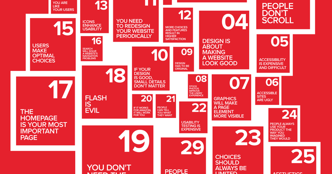
Inautilo<p><a href="https://mastodon.social/tags/Design" class="mention hashtag" rel="nofollow noopener" target="_blank">#<span>Design</span></a> <a href="https://mastodon.social/tags/Pitfalls" class="mention hashtag" rel="nofollow noopener" target="_blank">#<span>Pitfalls</span></a><br>Top 10 UI annoyances · Common usability flaws of modern interfaces <a href="https://ilo.im/165m9p" rel="nofollow noopener" translate="no" target="_blank"><span class="invisible">https://</span><span class="">ilo.im/165m9p</span><span class="invisible"></span></a></p><p>_____<br><a href="https://mastodon.social/tags/Errors" class="mention hashtag" rel="nofollow noopener" target="_blank">#<span>Errors</span></a> <a href="https://mastodon.social/tags/Clutter" class="mention hashtag" rel="nofollow noopener" target="_blank">#<span>Clutter</span></a> <a href="https://mastodon.social/tags/Barriers" class="mention hashtag" rel="nofollow noopener" target="_blank">#<span>Barriers</span></a> <a href="https://mastodon.social/tags/Accessibility" class="mention hashtag" rel="nofollow noopener" target="_blank">#<span>Accessibility</span></a> <a href="https://mastodon.social/tags/Usability" class="mention hashtag" rel="nofollow noopener" target="_blank">#<span>Usability</span></a> <a href="https://mastodon.social/tags/DeceptiveDesign" class="mention hashtag" rel="nofollow noopener" target="_blank">#<span>DeceptiveDesign</span></a> <a href="https://mastodon.social/tags/ProductDesign" class="mention hashtag" rel="nofollow noopener" target="_blank">#<span>ProductDesign</span></a> <a href="https://mastodon.social/tags/UxDesign" class="mention hashtag" rel="nofollow noopener" target="_blank">#<span>UxDesign</span></a> <a href="https://mastodon.social/tags/UiDesign" class="mention hashtag" rel="nofollow noopener" target="_blank">#<span>UiDesign</span></a> <a href="https://mastodon.social/tags/WebDesign" class="mention hashtag" rel="nofollow noopener" target="_blank">#<span>WebDesign</span></a></p>
Jerome<p>This week, at the project retrospective, none of us identified any big issues. It reflects the good job we did as a team.</p><p>Last week, at the presentation of user research findings and recommendations, the customer team showed enthusiasm. Their team lead said he had read my draft UR report multiple times.</p><p>That's one way to flatter me. ❣️</p><p>Another is to implement my recommendations and then retest the usability.</p><p><a href="https://mastodon.social/tags/UR" class="mention hashtag" rel="nofollow noopener" target="_blank">#<span>UR</span></a> <a href="https://mastodon.social/tags/UserResearch" class="mention hashtag" rel="nofollow noopener" target="_blank">#<span>UserResearch</span></a> <a href="https://mastodon.social/tags/research" class="mention hashtag" rel="nofollow noopener" target="_blank">#<span>research</span></a> <a href="https://mastodon.social/tags/usability" class="mention hashtag" rel="nofollow noopener" target="_blank">#<span>usability</span></a> <a href="https://mastodon.social/tags/UCD" class="mention hashtag" rel="nofollow noopener" target="_blank">#<span>UCD</span></a> <a href="https://mastodon.social/tags/user" class="mention hashtag" rel="nofollow noopener" target="_blank">#<span>user</span></a> <a href="https://mastodon.social/tags/users" class="mention hashtag" rel="nofollow noopener" target="_blank">#<span>users</span></a> <a href="https://mastodon.social/tags/retro" class="mention hashtag" rel="nofollow noopener" target="_blank">#<span>retro</span></a> <a href="https://mastodon.social/tags/agile" class="mention hashtag" rel="nofollow noopener" target="_blank">#<span>agile</span></a> <a href="https://mastodon.social/tags/consulting" class="mention hashtag" rel="nofollow noopener" target="_blank">#<span>consulting</span></a></p>
David W. Jones<p>After decades of experiencing user interfaces, thoughts about UIs on my blog. <a href="https://mastodon.social/tags/UI" class="mention hashtag" rel="nofollow noopener" target="_blank">#<span>UI</span></a> <a href="https://mastodon.social/tags/usability" class="mention hashtag" rel="nofollow noopener" target="_blank">#<span>usability</span></a> <a href="https://mastodon.social/tags/technology" class="mention hashtag" rel="nofollow noopener" target="_blank">#<span>technology</span></a></p><p><a href="http://dancingtreefrog.com/2025/07/23/thoughts-after-decades-of-experiencing-user-interfaces/" rel="nofollow noopener" translate="no" target="_blank"><span class="invisible">http://</span><span class="ellipsis">dancingtreefrog.com/2025/07/23</span><span class="invisible">/thoughts-after-decades-of-experiencing-user-interfaces/</span></a></p>
Replied in thread

@bitnacht Light gray on light gray – for usability, expression, recognizability and visibility a total failure. 
But the trend started earlier, with app-like icons, which made them all too similar without their distinct shapes, and an iPhone-Like menu in Preferences.app.
Seriously, it seems like Apples #usability-concerned #GUI department has been replaced by a Graphics (just the looks) department and an UX (upselling) department. Something that already happened at Microsoft.

TrendingLive feeds
Mastodon is the best way to keep up with what's happening.
Follow anyone across the fediverse and see it all in chronological order. No algorithms, ads, or clickbait in sight.
Create accountLoginDrag & drop to upload