
Administered by:


#finder
0 posts0 participants0 posts today


 El Finder de macOS Tahoe es el verdadero superpoder oculto del Mac.


Szeretnéd, ha a Findered okosabb lenne macOS-en? Ezzel a kiegészítővel az AI segítségével menedzselheted, konvertálhatod vagy akár szupergyorsan kijelölheted a fájlokat a Finderben – akár magyarul is!  Felgyorsíthatod a munkádat természetes nyelvű utasításokkal!

https://techwok.hu/2025/07/12/ai-funkciok-a-finderhez-substage

Techwok · AI funkciók a Finderhez: turbózzuk fel a macOS fájlkezelőjét - TechwokBár nem az Apple-től érkeznek, de akadnak AI funkciók a Finderhez, amelyekkel jelentősen felturbózhatjuk a macOS fájlkezelőjének tudását.


@siracusa @caseyliss You know how #iCloud does that "if it's not downloaded to your #Mac, it has a cloud w/a down arrow on it in the #finder" thing...? And you have to click that manually to open the file?
How do I use command line to know when my script hits one of those so I can know what to do in order to DL it to process it?  Lately a lot of new files are not downloading automatically - and yes, I have "Optimize Mac Storage" unchecked.
#macOS15.5

This is the most Easter-Egg-y #Mac #finder hack ever.
Take any folder that has images in it. Rename it to "Pictures"
Right-click on the column headings and now you have the option to show "Dimensions" of the images. Enable this.
Rename the folder back to its original name. You still have a Dimensions column.

Bei all den Diskussionen zum #Finder-#Icon fällt mir wieder ein, dass Vera F. #Birkenbihl auf dem Umschlag zu ihrem Buch über Kommunikationstraining eine Hommage an das Symbol (das seinerseits eine Hommage an #Picasso ist) verwendet hat.

O Finder, where art thou?

I think Gruber is spot-on with his analysis of the updated Tahoe Finder icon. He clarified what I couldn't put my finger on.
I'd go so far now as to say it looks like "Phantom of the macOS”.

512 Pixels · macOS Tahoe Beta 2 Fixes the Finder Icon - 512 Pixels
More from  Stephen Hackett


Sorry, macOS Tahoe Beta 2 Still Does the Finder Icon Dirty
512 Pixels · macOS Tahoe Beta 2 Fixes the Finder Icon - 512 Pixels
More from Stephen Hackett


Apple aggiorna l'icona del Finder su macOS, unendo tradizione e novità.
 Il lato sinistro torna blu.
 ️ Il lato destro ha un gradiente bianco/blu.
Viene mantenuto l'aspetto Liquid Glass, per un design che richiama il classico ma con un tocco moderno.

19 nuances de Finder : l'icône ne récupère pas sa bonne face en mode sombre http://dlvr.it/TLX3Sq #macOS #Finder

MacGeneration · 19 nuances de Finder : l'icône ne récupère pas sa bonne face en mode sombre
 El ícono del Finder vuelve a su esencia en macOS Tahoe Beta 2: Apple da marcha atrás tras las quejas y recupera los clásicos colores azul y celeste… pero con efecto Liquid Glass
  ¡Volvió el de toda la vida, pero con brillo!
 Replied in thread

@marioguzman So why is #Apple afraid of having a black user looking at their #Mac screen with a smiling face? Or do they have a thing for Eiffel 65? #Finder

Des astuces méconnues du Finder sur Mac
https://mac4ever.com/189861
#Mac4Ever #Finder #macOS


 AAPL Ch.
 2022年にサブスクリプションモデルに移行したMac用多機能ファイラー「Path Finder」が買い切りライセンスの販売を再開。
https://applech2.com/archives/20250620-path-finder-for-mac-support-license-key.html
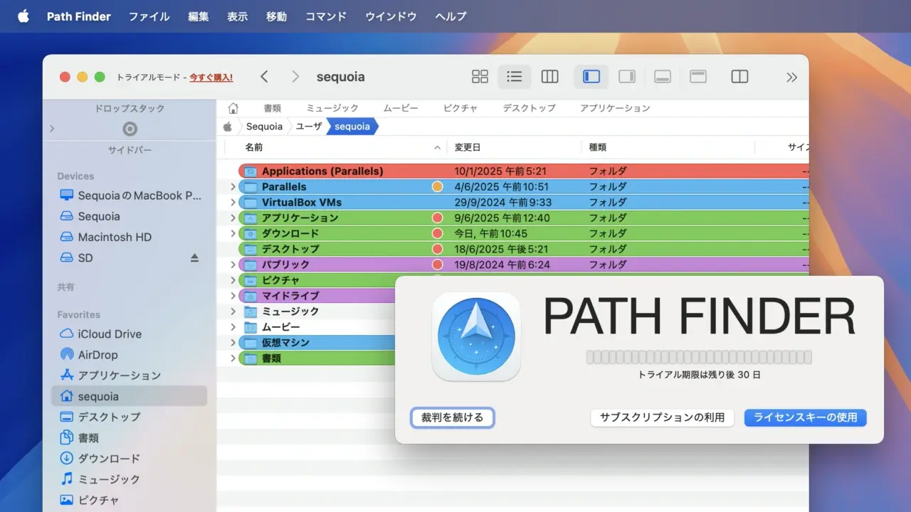
AAPL Ch. · 2022年にサブスクリプションモデルに移行したMac用多機能ファイラー「Path Finder」が買い切りライセンスの販売を再開。米カリフォルニア州のCocoatechは2022年02月、旧Finderスタイルの機能を取り入れた多機能ファイラー「Path Finder」をサブスクリプションモデルに移行したと発表しましたが、2025年06月05日付けで再びライセンスキーの販売を開始したと発表しています。


Uncover the truth with our latest thriller based on a real-life case!
#Charlie's #Finder streaming now on #Tentkotta
 Subscribe Now
  tentkotta.com
Go legal say No to Piracy