#typography
I’m a little saddened by the gradual embiggening of font sizes on desktop computers over the past 25 years, mostly thanks to the web. Going from 11–13 pt as the standard systemwide font, to the 15–20 pt standard found on websites, is wasting so much real estate. Not only does this make system text look tiny next to web content, window chrome has gradually grown to balance out the appearance of web content as it takes over the desktop, with bigger and bigger swaths of empty margins to make the visuals work better.
Going back and forth between high-density system text and web content is jarring. I also miss my real estate. My 16 inch display feels just as cramped as my 14 inch display 20 years ago.
2025-07-29 Ford Capri #type #typography #chromeography
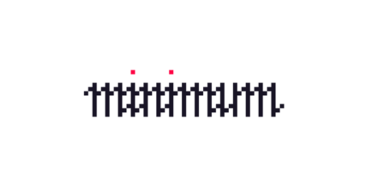
433 - How to Make a Font that Says Nothing · Untested

Check out this fun #typography project where they designed a bunch of free-to-use check marks that match popular #fonts. (Scroll down to the beige area to download the EPS files!)
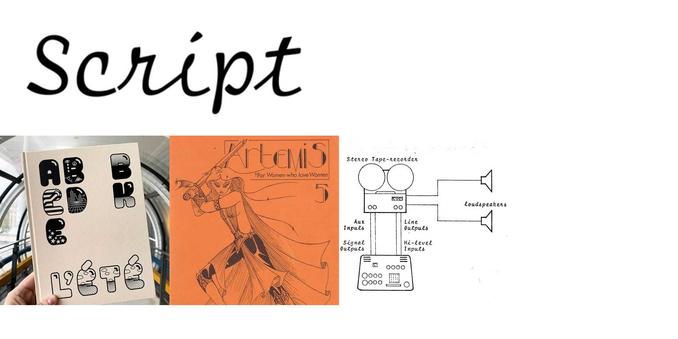
i wish literally anyone was making cursive monospace fonts suitable for terminal use, along the lines of Bitstream's Script 12 Pitch (based on the IBM Selectric Script font)
Alexsandar Stevanov did some but they're severely lacking in glyphs. there's DutchFonts' Pigtail. anything else?
P. S. here's the rest of the Selectric typewriter fonts Bitstream digitized). nostalgiaaaa

It's pretty rare to spot Peignot Bold on the street nowadays. #typography in Finsbury park, London
Maybe you've tried out Typogram and ask yourself why selecting and moving letters around isn't as easy in Adobe apps. Check out my video for your options in Illustrator and InDesign. There is an often overlooked tool in Illustrator that you might want to discover: https://youtu.be/oOMBtBylolM #illustrator #indesign #text #typography #tutorial
Mocha Bubble + Sans Font Duo by Sam Parrett of Set Sail Studios https://weandthecolor.com/mocha-bubble-sans-font-duo-sam-parrett-set-sail-studios/204865
I found some Comic Sans in real life, where do I report this?
Meow ~~ cute word art newly added to my collection: https://1-lisas-baker.pixels.com/featured/meow-lisa-s-baker.html
Soviel zu tun für Gendersterne und mehr...
Platz reservieren im Unicode Cosmos
Platz frei schaufeln im ASCII 8Bit Space
Platz frei kämpfen im ASCII 7Bit Space
Gute *-Ligaturen in Standard-Fonts gestalten
Gute Ligaturen in Standard-Fonts einbauen
Nutzung der Ligaturen in Texten anwenden
Bedeutung der Sterne leben
Impossible - But we are specialized in realizing the impossible !
An early #silentsunday morning in downtown #stlouis #missouri. #photography #typography #graphicdesign
Sonntagnachmittagsgedanken zu Gendersternchen
Diese Sternchen, Binnenmajuskeln und viele andere Möglichkeiten sind absolut notwendig.
Aber nicht schön, störend, den Textfluß hemmend. Ja, manchmal muss das so sein!
Für den Alltagsgebrauch brauchen wir aber eine schöne smoothe Lösung.
Können fähige Typograf*Innen da nicht mal tolle Ligaturen entwerfen ?
Haben wir im Laufe der Jahrhunderte mit & und ß doch auch geschafft.
Not my typical style of typography, tools or setting. Doing a good deed for the village church.
This artwork was inspired by my love of the Dr Suess book ‘The Places You’ll Grow’ and wildflower fields in Europe in the summer.
I hope to remind people that we might not know exactly where we’ll end up in life but that we’ll grow through our experiences. I also wanted the variety of flowers to symbolise how we’re all different but we still have our place and thing to offer to the world.
#bloomscrolling #lasercutart #watercolour #typography #flowerpower #wildflowers #personalgrowth
Someone at Home Depot Stockyards (Toronto) really loves lettering live your truth #typography
