Anyone here need a hand with a personal open source project?
I'm not looking to get money, just to collaborate on something beneficial to the community.
I'm into product design and software development.

Anyone here need a hand with a personal open source project?
I'm not looking to get money, just to collaborate on something beneficial to the community.
I'm into product design and software development.
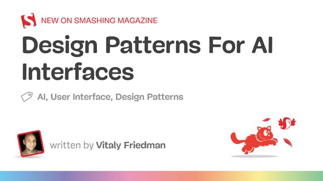
I left a comment last week on Smashing’s “Design Patterns For AI Interfaces” (which is still in moderation):
https://www.smashingmagazine.com/2025/07/design-patterns-ai-interfaces/
Essentially, if your UI doesn’t also try to prevent harm then it might be a shitty UI. I linked to my generic LLM chatbot attestation UI:
https://adrianroselli.com/2025/02/generic-llm-chatbot-attestation.html
Completely agree. Further evidence that Tesla-style bad #UI design “principles” are making their way into other software. (Imagine this kind of design on a screen in a moving vehicle. Good luck with the hand-eye coordination, requiring taking your eyes off the road — what could go wrong?)
Also, does the latest generation of UI designers have toothpicks for fingers?
 I was in need of a UI container that scales its contents to fit the size. In Godot all built-in containers reset scale and rotation of its child nodes, which means you cannot directly scale the child to solve this.
 Luckily, custom containers are stupidly simple! All it takes to create one is defining two methods:
https://gist.github.com/YuriSizov/88464b9f26736900e90c67f6a9c4e926
It's not perfect because Godot's UI sizing is not fully stable. But it serves me well!
Top 7 Mobile UI/UX Design Hacks Proven to Boost Conversion | Digital Synopsis
- Thumb-friendly navigation
- Simpler screens, less clutter
- Microinteractions for feedback
- Speed it up
- Bold but nice CTAs
- Personalize when possible
- Friction-free forms
As a long-time Mac user, I find the lack of consistency in Windows' UI utterly baffling, even in system applications from Microsoft.
#windows #microsoft #ui #baddesign
https://blog.alexseifert.com/2025/07/29/windows-hopeless-ui/
I’m a little saddened by the gradual embiggening of font sizes on desktop computers over the past 25 years, mostly thanks to the web. Going from 11–13 pt as the standard systemwide font, to the 15–20 pt standard found on websites, is wasting so much real estate. Not only does this make system text look tiny next to web content, window chrome has gradually grown to balance out the appearance of web content as it takes over the desktop, with bigger and bigger swaths of empty margins to make the visuals work better.
Going back and forth between high-density system text and web content is jarring. I also miss my real estate. My 16 inch display feels just as cramped as my 14 inch display 20 years ago.
There's a three pixel wide area down the middle where you can move, centered on the one pixel wide slightly lighter line. If you didn't already know that you can grab this line and move it around from earlier versions of Windows, you'd have a *three pixel wide* gap to notice your cursor changing.
When someone says games aren’t political, I say the UI is political! https://vm.tiktok.com/ZNdHuJd1X/ #games #southpark #UXdesign #Ui
NeoComment will come with "Forest" and "Beach" themes both available on light and dark mode  .
.
I need to show some more details for items in Explore view which is currently not available in the "trending" APIs of NeoDB, so I will have a hard time to initiate multiple requests to NeoDB instances. If I face rate limits I might be forced to show less items in the explore.
Thanks to @penpot I'm not a designer but Penpot made everything much easier for me.
A stunning interface may impress—but if users get lost using it, they won’t stick around. Design should serve usability, not overshadow it.
Function before form.
Clarity before cleverness.
Where do you draw the line between elegant visuals and functional design? #UI
Huh. Well this is new.
In 2005-2015 there were tons of web galleries that showcased cool web design from around the internet.
Are there any sites like that around anymore? I know Dribbble still exists.
what controls when submenus open downward vs when they open upward?
Here on the 'don, my 'emojis' submenu typically opens downward (boo - it often goes past the bottom of the screen) on a first try, and upward (yay! always works) on a second try.
Screencaps from a submenu in calendly.com that opens downward (yay! all options visible!) when it's the at the top of a list, but upwards (boo! opens *behind* a spacer that obscures several options).
Five usability- and design sites I use:
1. Discount software-design method:
https://fivesketches.com/quality-software-designs-by-sketching/
2. UK's methods and patterns:
https://design-system.service.gov.uk/
3. Nielsen Norman Group's posts about user research and design:
https://www.nngroup.com/articles/
4. MeasuringU's posts about research statistics:
https://measuringu.com/
5. USA's definitions and resources:
https://digital.gov/resources
Mini release for my Bubble UI for Ais project:
- autosave chat history
- sliding sidebar
- color-code for save chats
Getting there !
#AI #LLM #UI #Frontend #OpenSource #ChatUI #JavaScript #UXDesign #PromptEngineering #GoogleGemini
Check it out :
https://github.com/KenoLeon/BubbleUI
From Louie Mantia: A Responsibility to the Industry